Work / Packaging / Shabby Chic
Four scents, one family of flowers.
Shabby Chic is Rachel Ashwell's vintage, faded-floral lifestyle brand. For Hunter Amenities I designed a bath, body and home fragrance line under that name: the concepts, the illustrations and the packaging, from hand cream tubes to gift boxes.
Concept rounds
Two directions before the one.
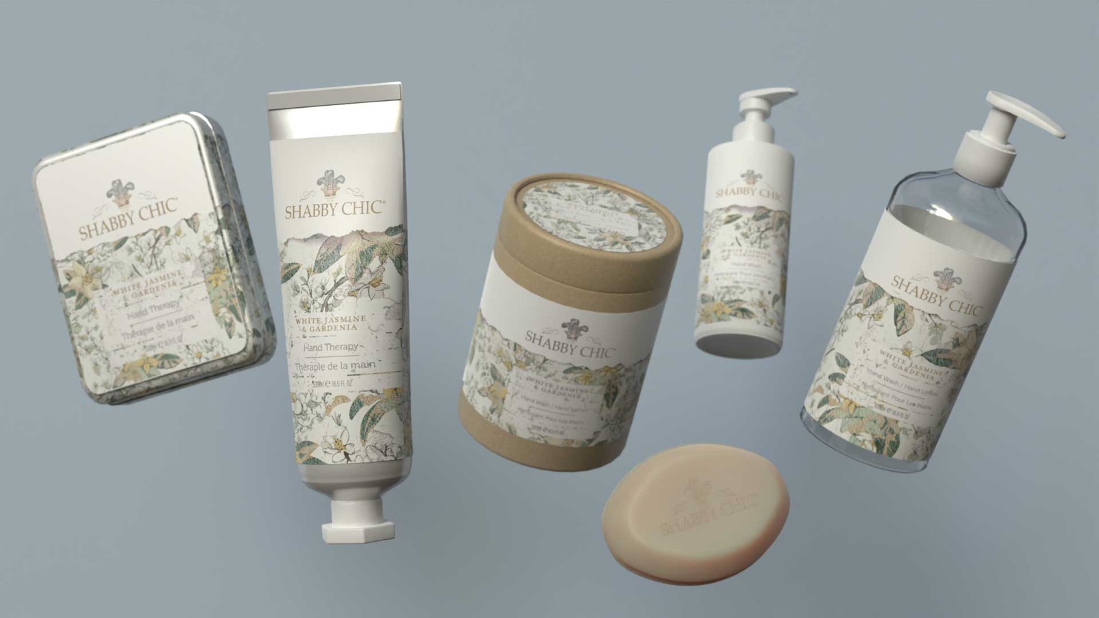
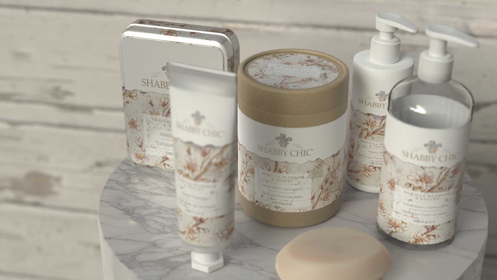
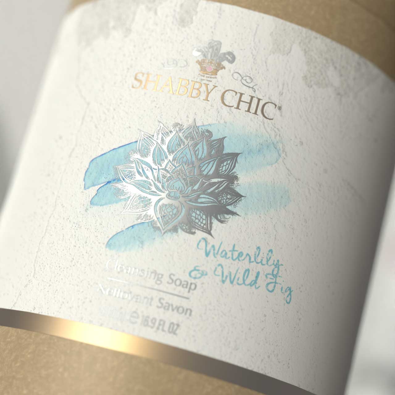
The first concept wrapped kraft canisters and silver tubes in bands of vintage floral, a different illustration for every scent. The second painted a single flower in soft watercolour over a pale ground.
Palette
The palette of the work.
Colour
- Blush#CAB0A9
- Pale aqua#B6C6C0
- Rose#B56F86
Colours sampled from the work, not a published palette.
Type
Jasmine Jewel
Cormorant Garamond Scent names
Hand cream
Jost Labels, spaced capitals
The range
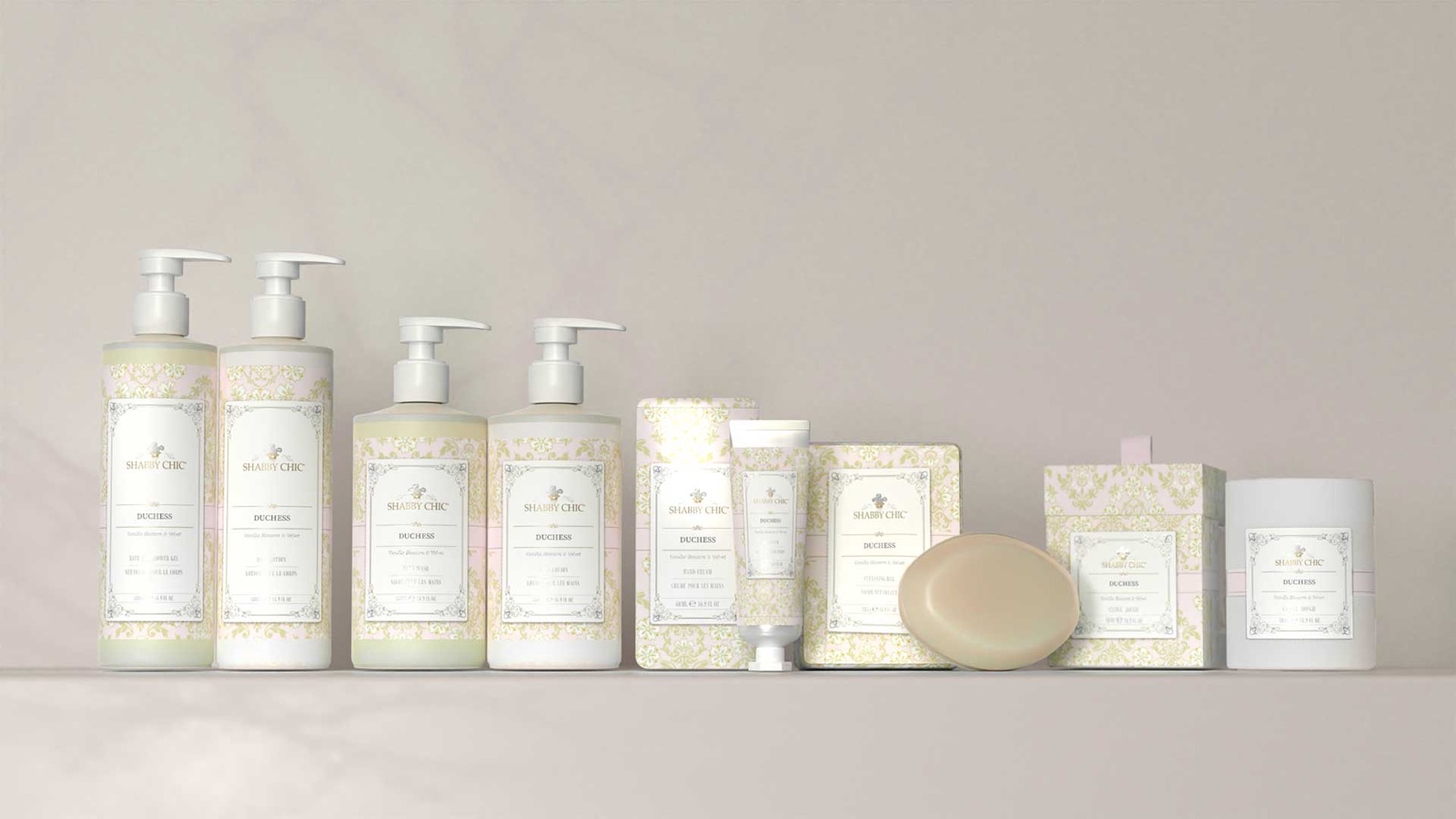
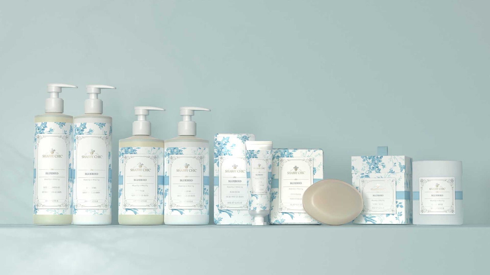
Each scent, its own floral.
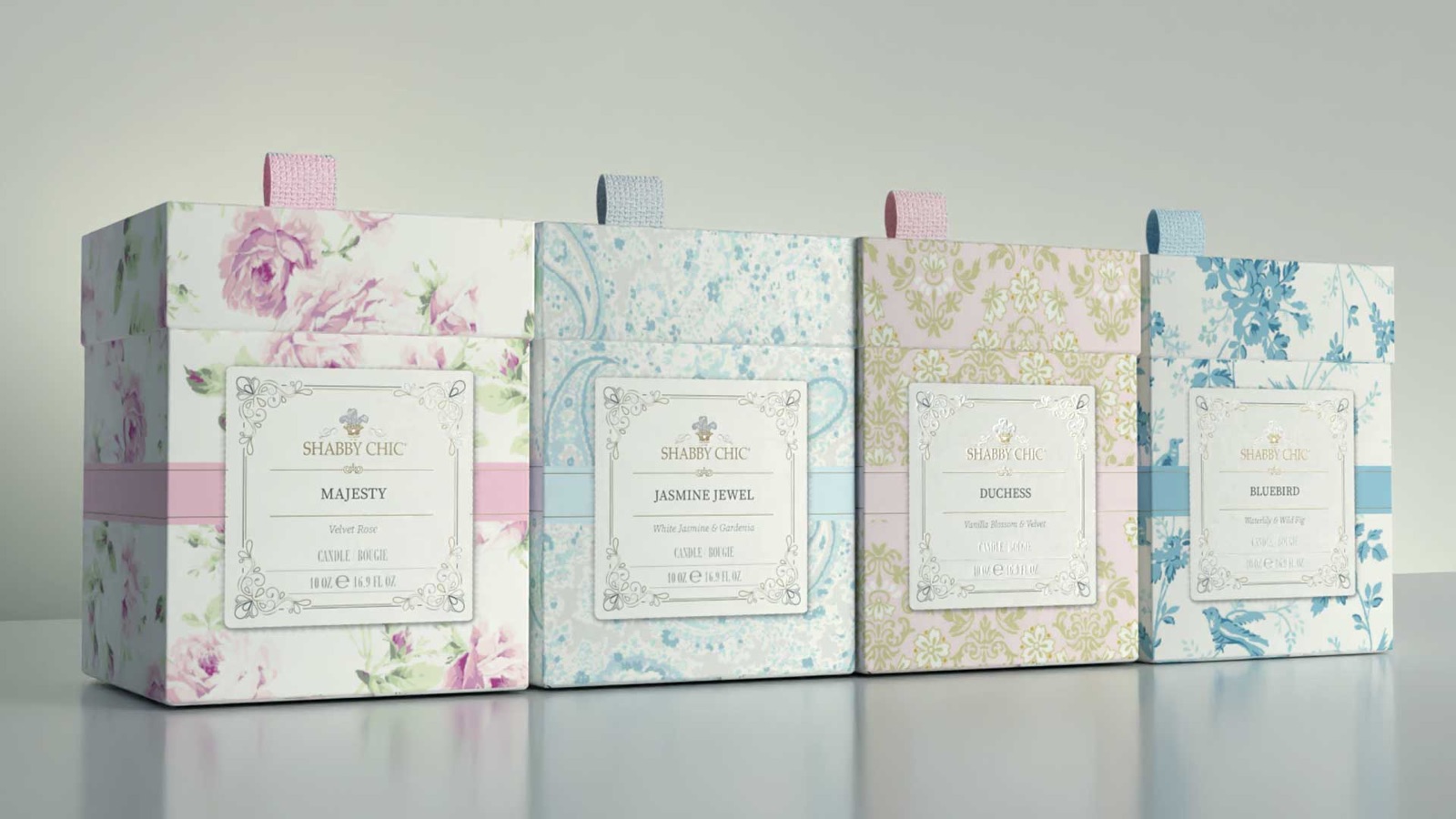
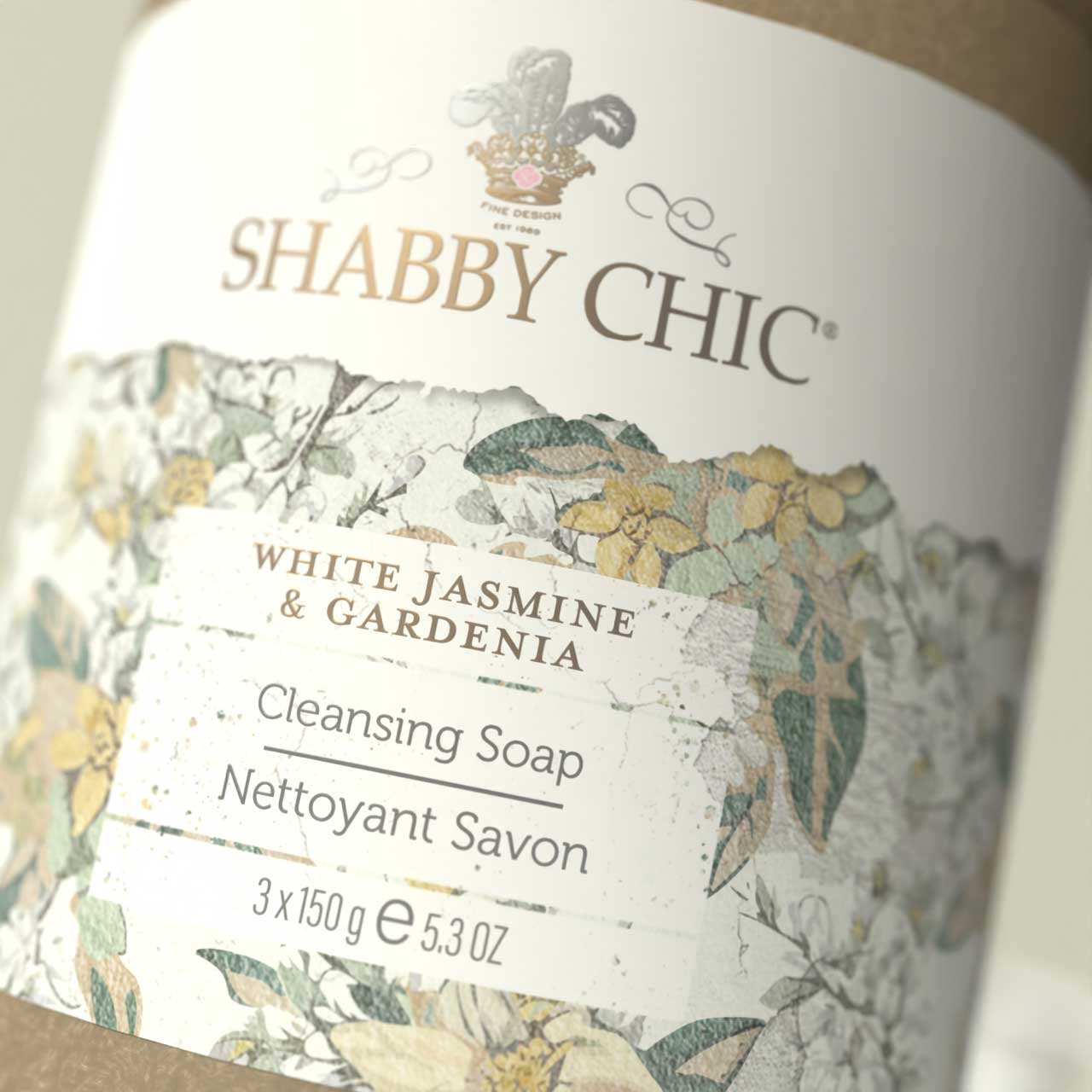
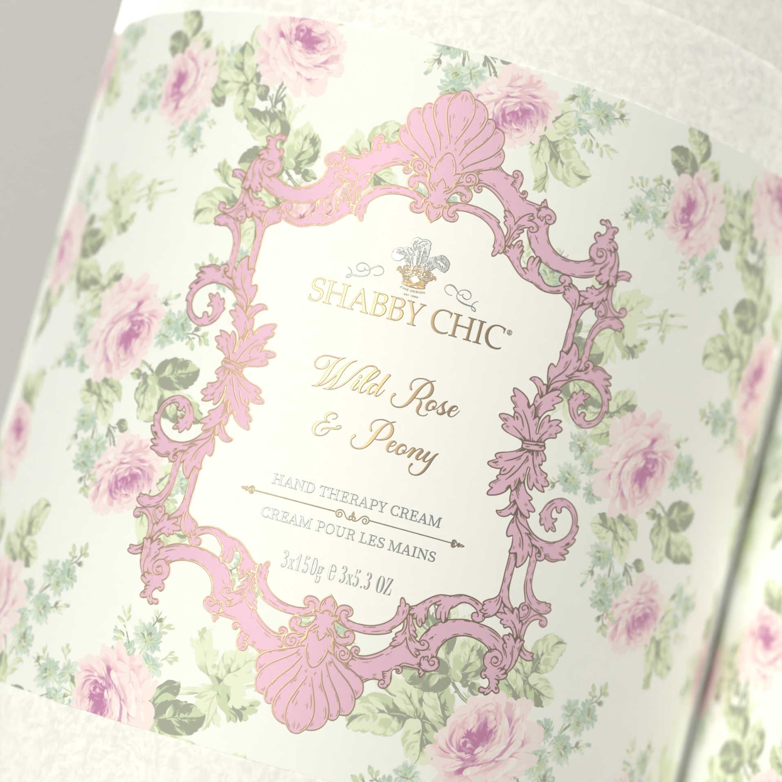
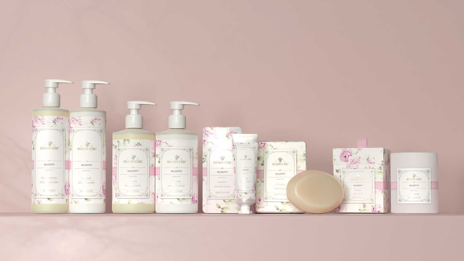
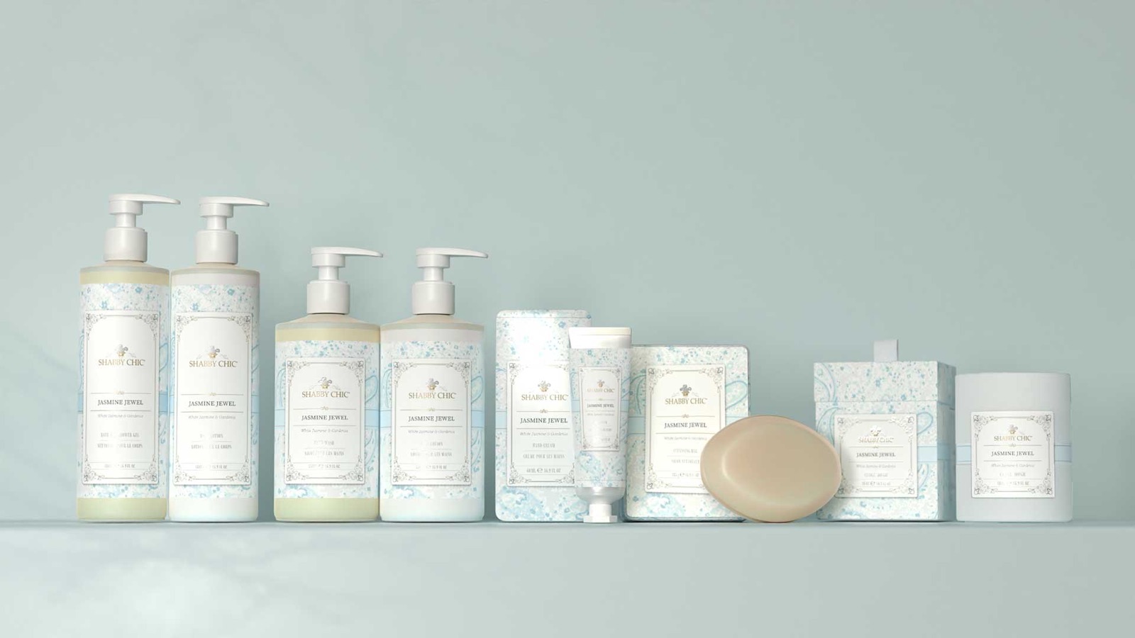
The chosen direction gives each scent its own flowers and its own ground, held together by one ornate framed label and the Shabby Chic crest. Side by side they read as a family. Pick one up and it reads as a single gift.
The gift boxes
Made to be given.
Each scent has its gift box, with a ribbon pull tab and the same framed label. The packaging is finished in gold and silver foil, so the metal catches the light the way ink cannot.